In a solemn, pre-dawn ceremony, the flag that’s been flying over Minnesota’s Capitol for decades was lowered for the last time.
Voices hushed in a crowd of more than a dozen onlookers at 5 a.m. on Saturday as the flag with Civil War-era imagery was carefully carried from the darkened Capitol rooftop to the building’s front steps, where two National Guard members folded it into a tri-cornered shape and presented it to the state’s historical society for preservation.
As the sun rose, a new official banner was hoisted on the same flagpole overlooking St. Paul, a stripped-down design featuring distinct state symbols that supporters hope all Minnesotans can identify with for at least 100 years to come.
“I’m just watching history happen,” said Anita Gaul, a college history professor from southern Minnesota who helped redesign the flag and drove to St. Paul for the ceremony. “As we see it more and more and get used to it, people will really come to embrace it and identify with this new flag.”
The historic changeover to mark Statehood Day follows a whirlwind process late last year to rethink and redesign the symbols that have represented Minnesota for most of the state’s history. Minnesota’s former flag — the state seal at the center of a blue backdrop — was criticized for decades for imagery that was seen as problematic for its representation of Native American communities.
The new flag, which is already flying in front of some Minnesotans’ homes, will replace 120 of the former flags in nearly two dozen buildings around the Minnesota State Capitol complex. Local governments will have more time and discretion to make the switch.
The new design is not without its detractors, who see a hastily redesigned flag that strips away more than 100 years of state history. People have rushed to flag shops to grab a version of the former state flag. State Republicans have started selling T-shirts with the old emblems and the words “don’t PC our flag,” while some county boards have voted to reject the new design.
“I think for a very long time, especially in my neck of the woods, I’m going to see the old flag flying at a rate that far exceeds the new one,” said Rep. Bjorn Olson, R-Fairmont, who served on the commission to redesign the flag and carried a bill that stalled this year to put the new design up for a public vote this fall.
“It’s not about whether you like the flag or not,” he said. “It’s about whether Minnesotans should have the right to choose what represents them.”
Late last year, a 13-member commission created by the DFL-led Legislature was given a timeline of four months and a budget of $35,000 to redesign both the flag and the state’s seal.
The central image on both shows a white settler plowing a field in the foreground with a rifle and an ax resting on a nearby tree stump. In the background, a Native American man on horseback rides westward toward the setting sun.
That imagery dates back to the late 1800s and was criticized as a celebration of the idea that settlers were destined to take over the land. Others said Minnesota’s flag was hard to decifer from a distance and too much like more than a dozen other state flags that also featured their seal on a blue backdrop.
Commission members sifted through thousands of flag submissions from the public, who drafted up new banners flying pans of hot dish, laser-eyed loons, lakes and lots of pine trees.
The commission narrowed it down to a single finalist and made tweaks of their own to come up with the new design, a deep blue abstract shape of Minnesota with a white eight-pointed star, a nod to the state’s motto as the “star of the North.” Next to it is a solid block of light blue that represents Minnesota’s many lakes, rivers and streams.
Vexillologists, who study flag designs, gave Minnesota’s old flag an F but rate the new design as one of the best flags in the country. The new flag is a simplified version of a concept submitted by Andrew Prekker, a 24-year-old Luverne resident.
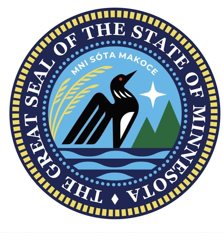
The new seal design features prominent state symbols such as a red-eyed loon on a Minnesota lake surrounded by pine trees, the North Star and sprigs of wild rice. Above the image are the words: “Mni Sóta Makoc̣e,” Dakota for the “land where the waters reflect the sky” and where Minnesota derives its name.
“You will see a state seal that is modern. That is inclusive. That no longer has imagery that some find deeply not just offensive, but painful,” Minnesota Secretary of State Steve Simon said to members of tribal nations this week. His office is the keeper of the state seal.
There are 71 versions of the current seal in 10 buildings in the Capitol complex. Lowering flags will be simpler than removing some versions of the state’s seal around the Capitol, which are affixed to everything from podiums and floors to etched into door handles.
Lee Herold, the owner of Herold Flags in Rochester, spent decades advocating for the Legislature to adopt a flag design that the public will embrace and fly proudly outside of their homes or display on coffee mugs and other merchandise.
Instead he’s seen the sales of the version of the old flag increase dramatically since the redesign, some months outselling sales of the United States flag, which has never happened before.
In recent weeks, he’s also seen an uptick in sales of the new flag as more people learn about the design.
“My goal was to have a flag that was popular, and that may still happen yet,” he said. “Time will tell.”
Star Tribune staff writer Rochelle Olson contributed to this story.
